Motivation:
Before choosing a dataset, I knew that I wanted to raise awareness on the imminent dangers that global warming presents us. It feels as though many people do not understand the severity of the warming trends that we are encountering. Ultimately, I came across a very large dataset on Kaggle that contained the total extent of Sea Ice in various regions of the arctic. The measurements date back to 1978, and map the day and month with a numerical measurement of sea cap extent (unit is 10^6 sq km), as well as the hemisphere. Kaggle is a free, open-sourced website where people can download a variety of useful and informative datasets.
Methods:
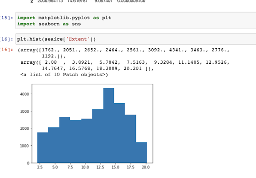
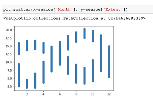
First, I downloaded the data and got rid of a few unwanted columns. Next, I used Jupyter Notebook to practice some very basic modeling techniques using Python. I began to create a couple of visuals to gain familiarity with the trends in the data. I plotted a histogram and scatter plot to see the distribution of and range of ice extent, and to see which extent values fell under each of the twelve months.
Findings:
I noticed that September had arguably the largest variability in Sea Ice extent, while June and December had less variable extent data. Furthermore, it seems as though certain months–such as February–had ice extent that was either very high or very low–with little to no values in between. I plan to put together more visuals in the future, including models that split up the data by hemisphere so I can ask more specific questions. Furthermore, I would like to calculate and visualize more concretely how the extent of the ice has declined generally over time.
Data Visualizations:
Project Members:

Jon Huber
Graduated: Class of 2023
Major: Program in the Environment and Computer Science